
Quick Answer
A useful website header identifies the business, gives visitors clear routes to important pages and keeps its controls usable on mobile and by keyboard. Plan the navigation around customer tasks, choose a clear next action and test the expanded, collapsed and focused states. A header’s appearance alone does not establish that its navigation works.
A visitor may arrive on a service article or product page without seeing your homepage. The header should help them recognize the business and find their next destination from that starting point.
Begin with the pages and tasks the navigation needs to support. The visual arrangement can then respond to those requirements.
Decide what belongs in the header
A business name or logo, primary navigation and an appropriate next action form a useful starting point. Depending on the site, visitors may also need search, an account route or a cart. Include a control because it serves a task rather than because another website has one.
Keep frequently needed destinations easy to distinguish. A customer seeking support should be able to find the support route without mistaking a sales inquiry button for technical help.
Write down the purpose of every proposed header item. If several items lead to the same place, or a label hides several unrelated services, review the structure before designing more controls.
Use labels that match the pages
Choose names visitors can understand without an explanation from staff. A menu organized around the business’s internal departments may not match the questions customers bring to the site.
Group related pages where that helps people compare them. Give a category an understandable overview page when one is useful, and distinguish a link to that page from a control that opens its child links.
W3C’s menu-structure guidance covers identifying navigation, labeling separate menus and indicating the current page. Keep wording and destinations consistent when the layout changes between desktop and mobile.
For the underlying page list, use the website content-preparation guide. The UX guide explains how to test whether the labels support a real visitor task.
Design the mobile header as a complete interaction
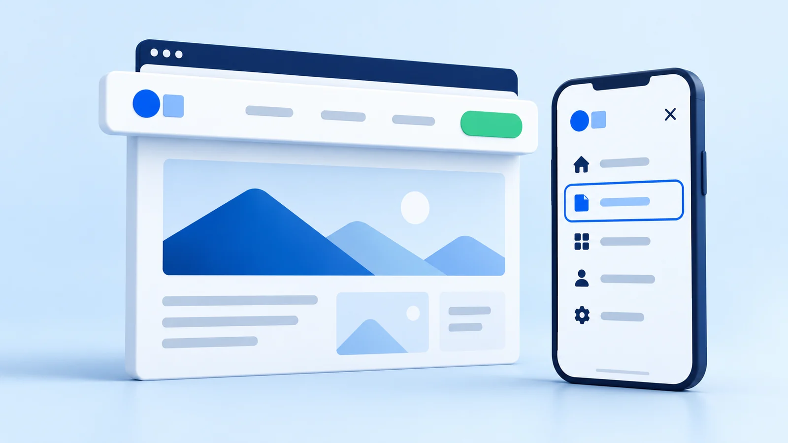
A collapsed navigation needs an understandable opening control, a readable list of destinations and a clear way to close it. Check the layout with longer labels, enlarged text and notices that might share the screen.
Keep important actions available without crowding the logo, menu control and other essential tools. If a phone number is a key route, make sure the business can handle calls and that the number is accurate.
Test the sequence rather than one screenshot: open navigation, expand a group, follow a link, return and close the panel. Check whether the current page and expanded states remain understandable. A desktop hover behavior should not be the only way to reach a submenu.
Check keyboard behavior and focus
Move through the header using the keyboard. The focus indicator should be visible, the order understandable and each control operable. Check what happens when navigation opens and closes, including where focus goes afterward.
Use suitable native links and buttons with names and states that match their behavior. W3C’s disclosure-navigation example explains why ordinary site navigation does not automatically need an application-style ARIA menu role. Its example also requires testing before production use.
Offer a working route past repeated navigation to the main content. Coordinate this with the page’s headings and landmarks, and include assistive-technology checks in the wider accessibility review.
Review sticky headers in the actual page
A header that stays visible while scrolling can preserve useful navigation, but it also occupies screen space. Test it on a narrow screen and at enlarged zoom, especially when the menu or another notice is open.
Check anchored sections and keyboard-focused controls below it. W3C documents a focus-obscuring failure caused by sticky headers or footers. The implemented layout needs to account for content moving behind those layers.
Choose sticky behavior from the visitor’s needs and the tested result. An elaborate shrinking animation adds states that also need review.
Keep a short header test record
Use a representative service page as well as the homepage. Ask someone to find a service, contact the business and reach support where applicable. Record the starting page, screen or input method, chosen route and any point of confusion.
- Does the logo identify the business and lead to the intended destination?
- Can people find important pages with the wording provided?
- Can every dropdown and mobile panel be opened, used and closed?
- Does focus stay visible around sticky content?
- Do search, account and cart controls work where present?
Retest after shared navigation changes. A header appears across many pages, so one broken destination or hidden control can affect several visitor paths. The footer guide covers supporting routes at the other end of the page.
Key Takeaways
- Plan header items around real visitor destinations.
- Use understandable labels and consistent page relationships.
- Review mobile navigation as a sequence of actions.
- Test keyboard access, focus and sticky-header overlap.
- Retest the shared header after changes.
Frequently Asked Questions
How many navigation items should a header have?
Use the destinations the audience needs and test whether the grouping is understandable. There is no universal item count that makes every business website easier to use.
Should every header be sticky?
Check whether persistent navigation helps the tasks on your site and whether it leaves enough room for content. Test zoom, mobile use and focused elements before choosing the behavior.
Can I use the same navigation on mobile?
The page relationships and labels can stay consistent while the presentation changes. The collapsed controls, expanded groups and close behavior still need to work with touch and keyboard input.
Does a page builder make navigation accessible automatically?
The actual component, settings, content and customizations determine the result. Test the implemented header, including its states and any code added to it.
A website refresh can address a focused navigation problem. If the page structure also needs to change, discuss the broader requirements through website redesign.