
Quick Answer
HSL expresses an sRGB color using hue, saturation and lightness, with optional transparency. It can make certain color adjustments easier to describe, but its lightness value is not a measure of perceived brightness or text contrast. Check the actual foreground and background combination before approving a palette.
Read the three components
The MDN hsl() reference explains the syntax and its sRGB basis. In a familiar percentage-based form:
.example-accent {
  color: hsl(220 70% 40%);
}
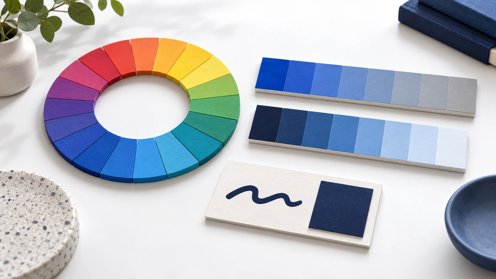
The hue is an angle around the color wheel. Saturation describes the color’s saturation within this model: zero percent gives a gray result. Lightness runs from black at zero percent to white at 100 percent. An optional alpha value controls transparency.
For example, hsl(220 70% 40% / 0.5) is partially transparent. Its displayed result depends on what sits behind it, so reviewing the color on a white artboard cannot establish how it will look over a photograph.
Use HSL for a controlled comparison
Start with an approved color and change one component at a time. A designer might compare a less saturated accent for a quiet surface or adjust hue to explore another brand direction. Keep the original and candidate values together so the comparison can be reproduced.
Changing the format does not automatically improve the color. Hex, RGB and HSL can describe the same sRGB color. HSL does not inherently make an equivalent value more consistent across screens.
Keep numerical lightness separate from visual judgment
The CSS Color specification illustrates how two hues with the same HSL lightness value can look very different in brightness. Equal numerical steps do not guarantee equal perceived steps. A palette made by adding the same amount to every lightness value still needs review.
W3C’s text-contrast guidance uses the relationship between the foreground and background. Do not substitute an HSL lightness threshold for that assessment.
For an illustrative test, place the real link text on each proposed background, including the hover and focus states. Check the rendered color pair and whether the link remains identifiable in context. A swatch alone does not show those states.
Give each approved color a role
Name colors by purpose where practical: body text, content surface, accent, border and focus indicator. Record the approved foreground/background combinations and exceptions. A single “brand blue” value may not be suitable for every role.
If the implementation derives shades automatically, review those outputs too. Our relative-color guide explains dependencies, fallbacks and browser checks. For reusable values, the CSS variables guide covers scope and overrides.
Review the actual page
- Confirm the intended computed values.
- Inspect light and dark surfaces used by the design.
- Check transparent colors over their actual backgrounds.
- Test text, controls and interaction states.
- Record any exception before handing off the palette.
Interactive Online’s accessibility work can examine the page’s color use within an agreed review scope. Choosing a color notation does not establish accessibility conformance.
Key takeaways
- HSL is a way to express an sRGB color.
- Hue, saturation, lightness and alpha describe different components.
- HSL lightness is not a contrast score or a uniform brightness scale.
- Approve colors in their actual roles, backgrounds and interaction states.
Frequently asked questions
Does HSL render better than an equivalent hex value?
Equivalent sRGB values describe the same color. Choose a notation that suits the workflow, and verify the actual rendered result.
Does lower lightness always produce readable text?
No. Readability depends on the foreground/background pair and the text. Measure the relevant contrast rather than assuming a particular HSL number is sufficient.
Should every brand color have identical saturation and lightness?
Use the brand’s approved roles and visual requirements. Identical numerical settings across different hues do not guarantee a balanced or accessible palette.