
Quick Answer
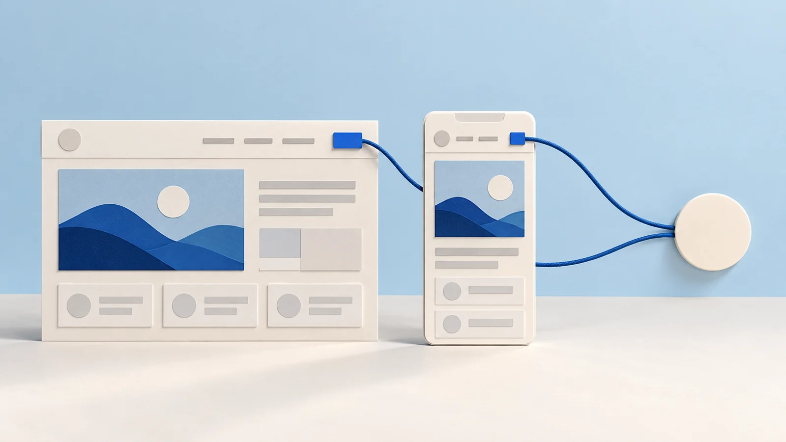
The historical Divi Portfolio header uses separate desktop and tablet/mobile modules. Updating one copy does not establish that the other now has the same menu, logo or button destination. Identify each active module and reconcile its content before approving the responsive header.
Recognize the layout’s separate copies
The November 7, 2023 Elegant Themes tutorial describes selecting menus, logos, social links and buttons separately for desktop and mobile. It also includes a global footer with a portfolio grid.
This is a review of that structure, not a supplied template download or a claim that its current import behavior has been tested. Check the actual installed version and template before following historical interface steps.
Separate module content from responsive styling
The current Divi 5 Menu Module guide distinguishes selecting the WordPress menu, selecting the logo and controlling module visibility. A separate module can select a different menu even when it resembles another one visually.
Divi’s visibility guidance explains device and breakpoint controls. A hidden module can remain editable in the builder. Its faded appearance there is not the same as seeing the saved frontend at the intended width.
Reconcile one changed contact action
Suppose a hypothetical portfolio’s approved contact route changes. The desktop button has been updated, but the mobile copy still points to an earlier destination. This is an invented review exercise, not an issue observed on a client site:
- Desktop copy
- Identify its Button Module and record the approved label and destination. Keep that content decision separate from spacing or color changes.
- Mobile copy
- Locate the separate module active at the relevant narrow width. Compare its actual destination with the approved route instead of assuming desktop changes propagated.
- Menu source
- Check which WordPress menu each Menu Module selects. Sharing one menu source can share its menu items, but that does not establish that separate Button or Social Media modules share their content.
- Identity and social routes
- Compare the logo and each intended social destination across active copies. Remove or replace demonstration material through an approved content change.
- Saved-state review
- After an authorized correction, follow the action on the saved frontend at the relevant widths. Record which breakpoints and open-menu states were checked and what remains untested.
Keep the footer’s query separate
The publisher’s footer uses a Portfolio Module with selected categories. A header correction does not establish that its project query or contact links are correct. Review the intended footer content and scope independently before applying a shared template change.
The header planning guide covers visitor navigation tasks. The header ownership guide covers template and editing scope, while the category-archive guide reviews post-query continuity rather than duplicated header content.
Key Takeaways
- Find every separate responsive module copy.
- Compare menu sources and independent button or social links.
- Distinguish builder visibility from saved frontend behavior.
- Record the widths and states actually reviewed.
Frequently Asked Questions
Does editing the desktop button update a separate mobile button?
Do not assume that. Inspect the actual module structure and shared-content arrangement, then verify both copies.
Can two Menu Modules use the same WordPress menu?
They can select the same source. Check their actual selections and review separate non-menu controls independently.
Why is a hidden module still visible in the builder?
Divi documents a faded builder preview for disabled elements so they remain editable. Check the saved frontend for the actual responsive result.