Utilizing Adaptive Design in Divi 5 with clamp()
Responsive web design is a key focus for every site creator today. Across various device ranges, including tablets, phones, and different screen sizes, maintaining a clean and user-friendly layout remains challenging. This article explores how using the clamp() function in Divi 5 can simplify this task.
The traditional method of setting fixed widths often leads to complications on diverse devices. Typically, builders address this by applying breakpoints—assigning different width values for desktop, tablet, and mobile views. However, these breakpoints often don’t align perfectly with the actual dimensions of specific devices, leading to inconsistent visual experiences.
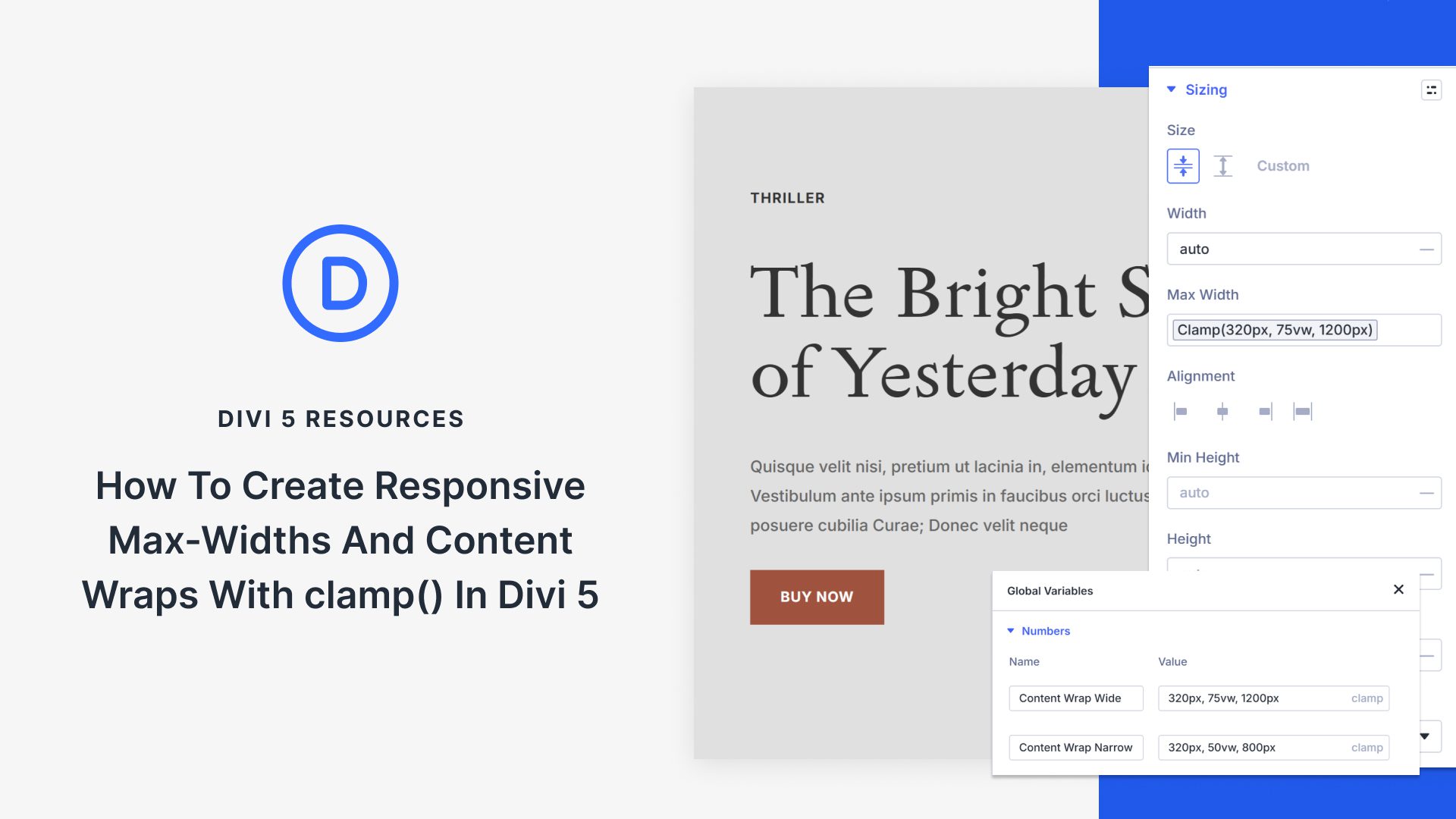
The clamp() function offers a modern solution to this problem. By setting a minimum, preferred, and maximum value, it allows an element’s size to adjust responsively based on the screen’s width. For instance, with clamp(320px, 80vw, 1200px), the element will maintain an optimal size without requiring multiple breakpoints.
Implementing clamp() in Divi 5 is straightforward. Divi 5 supports a robust system of Design Variables, allowing you to assign and update values globally across your site effortlessly. By leveraging these tools, you can ensure your content wraps remain consistent and functional across a multitude of devices.
For those involved in web design, Divi 5’s seamless integration with adaptive design principles like clamp() enhances both efficiency and user experience. Explore Divi 5 and streamline your web design process today.
Key Takeaways
- Traditional breakpoints can’t address all device dimensions effectively.
- The clamp() function adjusts sizes responsively without specific breakpoints.
- Divi 5 supports using clamp() through Design Variables for efficient site-wide updates.
- Design Variables in Divi 5 enhance consistency and maintainability in website design.
- Divi 5’s integration with clamp() supports modern, user-friendly site layouts.
FAQs
What is the clamp() function used for in web design?
The clamp() function helps create responsive design by adjusting element sizes based on screen width, eliminating the need for multiple breakpoints.
How does Divi 5 aid in using clamp()?
Divi 5 supports Design Variables that allow users to apply and update clamp() values consistently across all site elements.
Why is it important to use adaptive design?
Adaptive design ensures that websites remain visually appealing and functional across various devices, including tablets and phones.
Can clamp() replace breakpoints entirely?
While clamp() aids in responsive design, some specific scenarios might still require breakpoints for optimal results.
How do Design Variables benefit web design?
Design Variables simplify updates and ensure consistency across a site, as any change made to a variable propagates throughout all instances where it’s used.
Enhance your web design strategy with Divi 5 and make your website adaptable to all screen sizes with ease. Learn more about Divi 5.
