Exploring CSS Grid with Divi 5 for Better Web Design
CSS Grid in Divi 5 enhances website design by introducing a powerful two-dimensional layout system. Previously, creating complex layouts involved workarounds like extra columns and negative margins. Now, with Divi 5’s CSS Grid and its Grid Offset feature, designers can position elements with precision without clutter.
The Grid Offset Editor allows users to define where an element begins, how far it stretches, and its height. This enables seamless control of the layout’s structure. The system works on the principle of grids built on lines. Vertical lines create columns and horizontal lines form rows. Modules reside in the spaces between these lines.
Using the CSS Grid, users can start, span, and end modules by setting specific lines, effectively managing the element’s layout without excess tricks. By adjusting Column Start and Span, designers can dictate an element’s position across the grid. The same principles apply vertically, ensuring consistent layout across different screen sizes.
Offsetting helps place modules accurately rather than relying on assumptions. Applying an offset modifies a module’s start line, while the span setting manages the space occupied from that point. By enabling Grid on a Section or Row in Divi, an automatic line structure is created. This structured layout makes positioning elements straightforward and consistent.
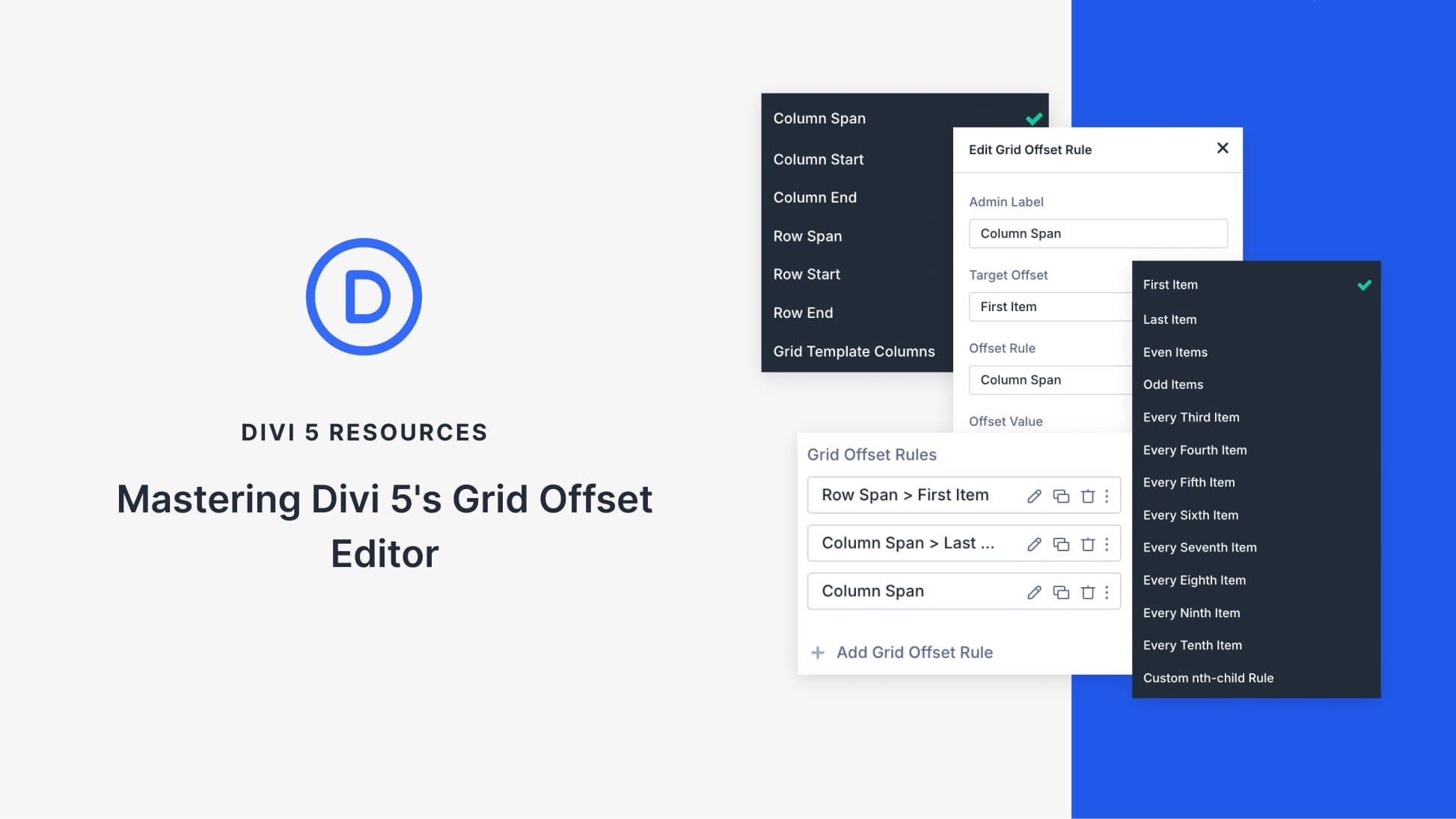
The Grid Offset Editor provides the ability to modify the placement of individual modules. Applying rules allows for flexibility without disrupting the existing grid structure. Settings like Column Span, Column Start, and Row Span enable unique layout configurations like full-width elements or staggered designs. This functionality facilitates responsive layouts that adapt naturally to various device screens.
Divi’s CSS Grid and Grid Offset Editor make it possible to design complex layouts without cumbersome techniques. With precise control over element positioning, designers can create visually appealing and functional web pages that adapt to changing content needs.
To learn more about Divi’s powerful features and enhance your web building experience, consider exploring the Divi Theme for versatile and dynamic design solutions.
Key Takeaways
- CSS Grid in Divi 5 provides a structured, flexible layout system.
- Grid Offset ensures accurate element positioning without clutter.
- Utilize start, span, and end settings for precise placement.
- Offset rules allow responsive layouts across different devices.
- Grid-based designs eliminate the need for traditional layout workarounds.
Frequently Asked Questions
What is CSS Grid in Divi 5?
CSS Grid in Divi 5 is a layout system that allows designers to position elements using a structured two-dimensional grid, enhancing flexibility and control.
How does Grid Offset improve layout design?
Grid Offset enables precise positioning by defining where an element starts and ends on the grid, removing the need for extra layout techniques.
What are the benefits of using Divi’s CSS Grid?
Divi’s CSS Grid offers structured control, adaptable designs, and eliminates the need for excessive columns or padding tricks.
Can I create responsive layouts with Divi’s Grid Offset?
Yes, the Grid Offset Editor allows for responsive design adjustments, ensuring layouts automatically adapt to various device sizes.
How do Column and Row settings work in Divi’s grid?
Column and Row settings define the starting point and span of an element, allowing for accurate alignment and spacing within the grid.
