Exploring the Innovative Grid System in Divi 5
Divi 5 introduces a new Grid system offering both horizontal and vertical content placement, redefining the approach to layout design. This integrated feature enhances design flexibility and empowers users with control over content structure. Grid supports working with Sections, Rows, Columns, and Module Groups, offering pre-built templates, or manual controls for custom layouts.
The main advantage of Grid lies in its ability to streamline layout creation by snapping items into place automatically, reducing the need for crafted elements. Users can alter column widths, modify row heights, and span multiple cells with ease.
Unlike Divi’s Flexbox, which handles alignment along one axis, Grid provides multidirectional placement and greater precision, ideal for complex designs. Users can switch between Flexbox and Grid without dismantling content, fostering seamless design iterations.
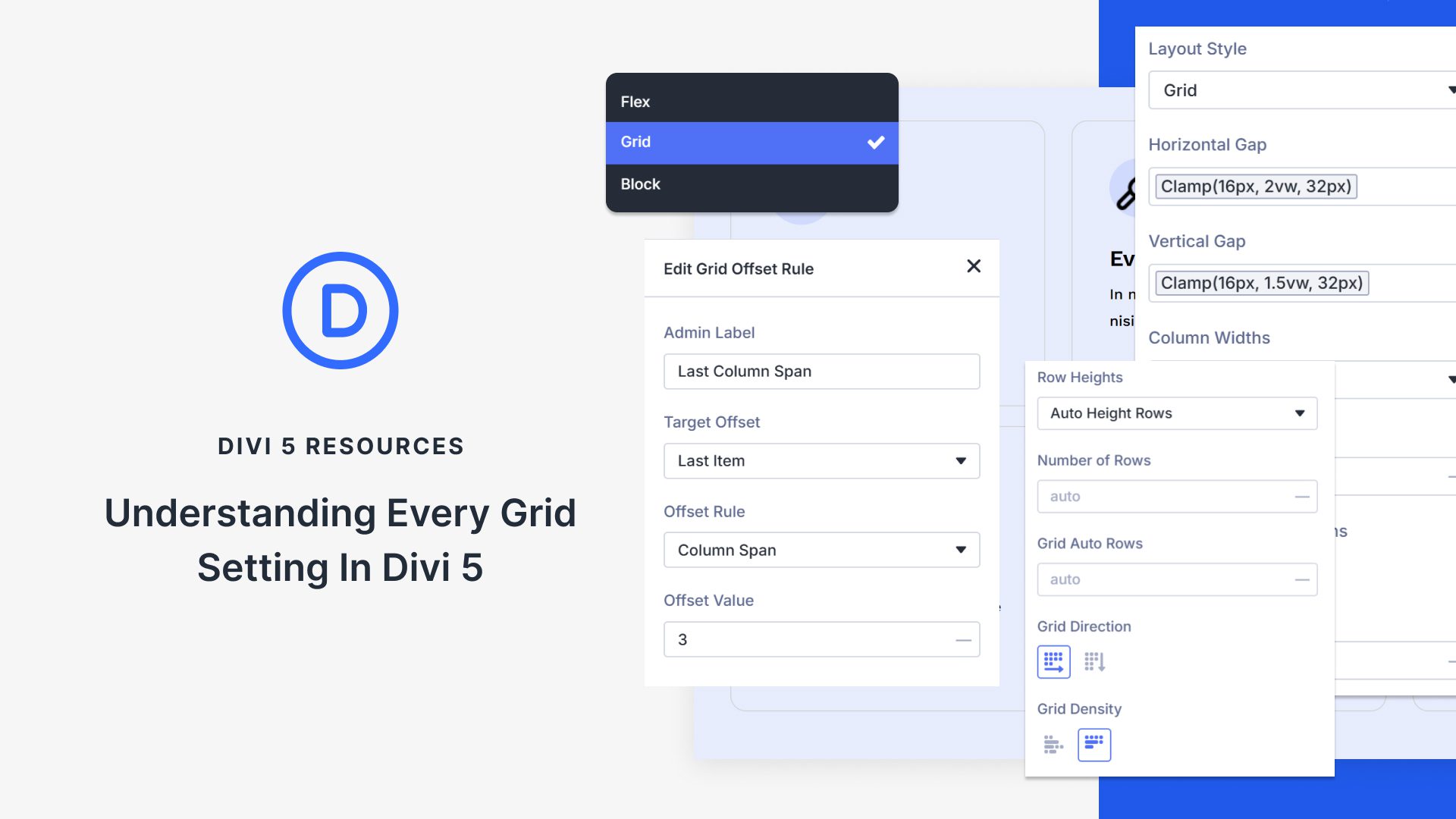
The Grid system hosts various settings to enhance layout customization. The "Horizontal Gap" and "Vertical Gap" settings control item spacing, while "Column Width" and "Number of Columns" shape the grid’s structure. "Collapse Empty Columns" ensures efficient use of space by hiding unused tracks.
Additionally, "Grid Auto Columns" and "Grid Auto Rows" offer automatic overflow handling, and "Grid Direction" dictates the content’s flow direction. "Grid Density" manages layout compactness, while "Justify Content" and "Align Items" deal with content alignment.
Grid’s "Offset Rules" allow manual item positioning for specific design needs. Users can manipulate item span, start, and end points for precise placement.
For those interested in enhancing their websites using AI-powered tools, consider exploring AI Website Builders. Moreover, for WordPress enthusiasts, the Divi Theme is a great tool for visually designing stunning web layouts.
By implementing Grid, Divi 5 empowers you to bring your design visions to life. Download Divi 5 today and create layouts that match your creative aspirations.
Key Takeaways
- Divi 5’s Grid offers multidirectional content placement, ideal for custom layouts.
- Provides control over rows, columns, and module groups through visual templates or manual settings.
- Flexbox aligns content on one axis; Grid allows more complex, precise positioning.
- Settings like "Horizontal Gap" and "Column Width" customize spacing and structure.
- "Offset Rules" enable item-specific positioning for unique design outcomes.
FAQs
What is the main advantage of using Grid in Divi 5?
Grid allows precise control over both horizontal and vertical content placement, streamlining complex layout tasks.
How does Grid differ from Flexbox in Divi 5?
While Flexbox handles alignment on a single axis, Grid provides a two-dimensional layout solution offering more precise control.
Can existing layouts be switched between Grid and Flexbox?
Yes, Divi 5 allows seamless switching between layout systems without disrupting existing content.
What settings help manage content spacing in Grid?
"Horizontal Gap," "Vertical Gap," and "Grid Auto Columns/Rows" manage how content is spaced within the grid.
How are "Offset Rules" beneficial in Divi 5’s Grid system?
Offset Rules give manual control over item placement, letting specific elements stand out or occupy designated spots in the layout.
