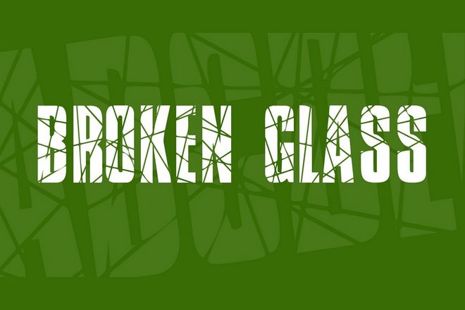
The article explores the concept of broken and cracked fonts, highlighting their significance as artistic expressions that convey raw, gritty, and sometimes rebellious vibes. The fonts discussed in the article are ideal for projects that require a touch of drama, an element of surprise, or a departure from the pristine and polished. The fonts are selected for their distinctive character, versatility, and ability to make a statement. The article showcases a variety of broken and cracked fonts along with images, each offering a unique style and design.
The article features a selection of fonts, including both free and paid options, such as Crushed, Ember, Broken, Bigger Cracks, Asphalt Crack, Broken Space, Shatterbox, Broken Glass, Glaz Krak, Opium, Gipsiero, and Breakaway. Each font is described in detail, highlighting its features, style, and potential use in various design projects. The article aims to provide designers with diverse options to find the perfect font for their creative endeavors.
In addition to showcasing the fonts, the article also offers 10 tips for choosing the right font for title designs. These tips focus on aspects such as reflecting the tone of the content, ensuring legibility, considering the font size, contrasting with the background, avoiding overused fonts, font pairing, considering the era, experimenting with different weights and styles, cultural sensitivity, and testing on multiple devices. The tips serve as a valuable guide for designers looking to make informed decisions when selecting fonts for their projects.
The article concludes with information about other font collections featured on the website, providing readers with additional resources to find the perfect font for their design projects.
Overall, the article serves as a comprehensive guide for designers interested in exploring broken and cracked fonts, offering a diverse range of options along with practical tips for selecting the right font for their design needs.
Read Full Article
