
Quick Answer
Choose a website layout from the visitor’s task, the content available and the order it needs to be read. A featured image, a gallery and a mixed-content page need different structures. Compare a few suitable patterns with real headings and images before adding effects or choosing a template.
Write the content sequence first
List what the visitor needs to understand and do: identify the offer, compare options, inspect work or follow a specific next step. Name the available text and images. A large empty hero or five nearly empty cards cannot be solved by arranging placeholders attractively.
The original January 26, 2024 layout collection introduced ten composition patterns. Use the following short comparisons to consider their content requirements; its old template examples are not current product recommendations.
Compare ten starting patterns
| Pattern | Content question |
|---|---|
| Three boxes | Do you have one main subject and two useful supporting items? |
| 3D screenshots | Does showing a real interface explain the product, and is the evidence ready? |
| Advanced grid | Which items deserve different visual sizes, and why? |
| Featured graphic | Can one strong image carry the page’s intended subject? |
| Five boxes | Are there enough distinct supporting items to justify the extra blocks? |
| Fixed sidebar | Does persistent navigation help, and how will the content sequence work without that column? |
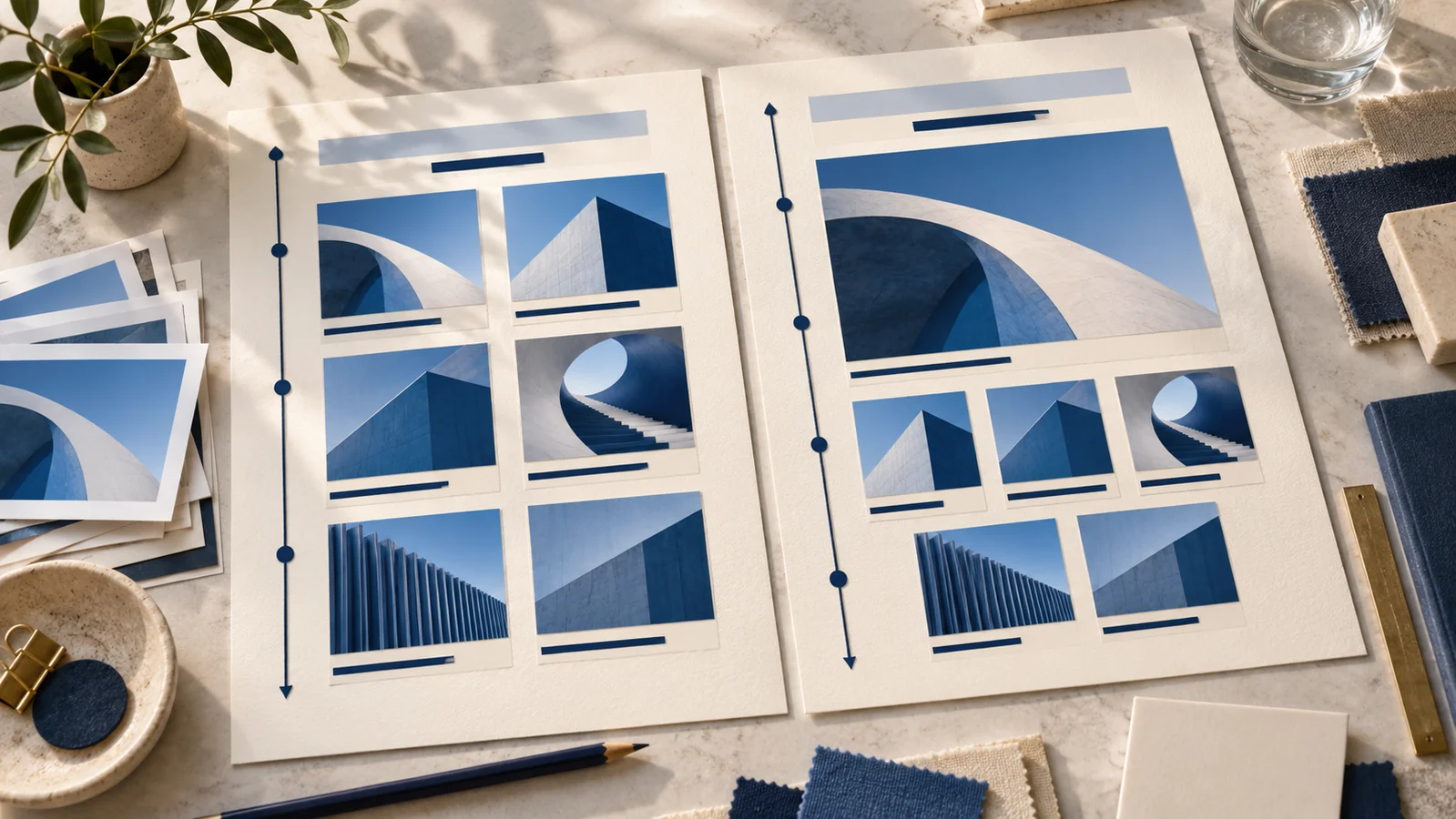
| Headline and gallery | Can a clear introduction and a consistent image collection answer the task? |
| Featured photo | Is the photograph useful evidence rather than decoration? |
| Power grid | Can several content types be grouped with a clear priority? |
| Fullscreen photo | Can the text remain readable and the main action discoverable over the image? |
Compare two plausible choices
For a hypothetical portfolio with six approved project images and short descriptions, a headline-and-gallery structure may expose the collection directly. A fullscreen photograph would prioritize one image and leave the remaining work for a later section. Decide whether the visitor first needs an overview or a close look at one project.
Record that reason with the selected sketch. If only two project images are ready, leave the missing material visible in the plan rather than duplicating images to fill six cards. This is a planning example, not a completed website test.
Preserve the reading sequence
Review the structure as a single column and inspect keyboard navigation when it is built. MDN’s Grid accessibility guide explains that visual placement does not automatically change the logical reading or tab order. Keep that sequence meaningful when a sidebar or varied grid changes position.
Our wireframe and mockup guide explains the separate design artifacts. The Grid and Flexbox guide addresses the technical layout model, and the image-sizing guide covers preparing images for accepted placements. Bring the content sequence and selected pattern to a website design discussion.
Key Takeaways
- Choose a composition from the content and visitor task.
- Give every large image and supporting block a purpose.
- Keep a meaningful reading sequence across layouts.
Frequently Asked Questions
Which layout is best for every business website?
The useful starting point depends on the task, content and imagery. Compare plausible choices with real material.
Should I fill every card in a template?
Use the blocks the content needs. Remove unnecessary structure or record missing material rather than duplicating placeholders.
Does moving a grid item also change its reading order?
Visual placement does not automatically change logical or keyboard order. Review the source sequence and actual navigation.